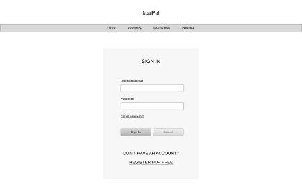
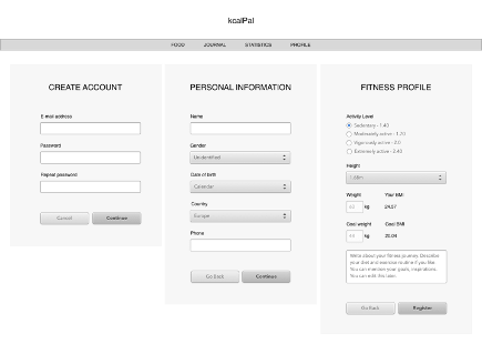
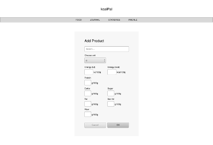
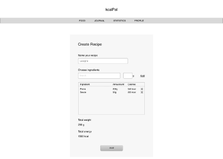
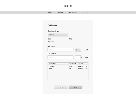
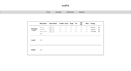
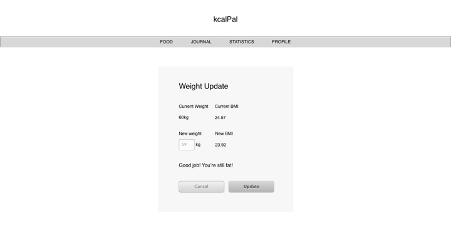
First iteration design based on wireframes
Evaluation
Advantages of this design:
- clean – there is a lot of white space which helps it look less crowded;
- readable – selection of fonts and their sizes enables good readability;
- simple – there is no redundant text decorations or animations;
- intuitive – ‘Cancel’ buttons are a lighter shade than ‘Submit’ buttons;
- easy to use – functionality is grouped into 4 main categories that are all easily accessible from the navbar.
Disadvantages of this design:
- mobile-like look – it looks as if it was a mobile application;
- not scalable – it is not designed for different screen sizes and would be hard to use on smaller screens;
- outdated design – the goal of creating a modern looking application was not achieved;
- indistinctive design – it has no original, one of a kind characteristics thus it would not be easily recognisable among other fitness applications.
Conclusions
The interface for kcalPal does not meet established goals. At this moment, the application does not solve the design problem. Although it has its advantages, it looks too much like a mobile application and it is not designed for various screen sizes. Very plain, boring and old-fashioned design will cause low interest in the application. The interface certainly needs to be redesigned.
